
Often times, when we're looking at a mass of data, we're trying to get a sense for relationships within that data. Who is the leader in this social group? What is a common thread between different groups of people? Such relationships can be represented hundreds of ways graphically, but few are as powerful as the classic network diagram.
Some may have seen their first network diagram in the form of a social network graph -- a web of dots connected by lines, some clustered closely, some drifting out in the periphery -- signifying that people share something in common. In network diagramming parlance, the dots are "nodes," and they frequently represent people in social networks. The lines connecting those nodes are called "edges," and they often times represent friendships or interactions.
If a node shares a high number of edges with a group of nodes, the nodes will be clustered near each other. That's the real power of network diagram, the ability to pick out close relationships at a glance.
What can we do with a basic network diagram?
In the past, this humble, yet powerful tool helped researchers understand the relationships between students in a classroom, and visualize 10 million activity logs to see how a law firm uses technology. Of course, network diagrams aren't limited to expressing social network data. Network diagrams, much like the Exaptive platform, is technology agnostic. In another post, I used a basic network diagram to show how Netflix's original television series are related, and what that could mean about Netflix's overall strategy for creating user-centric content.
A network diagram has been available in Exaptive's component marketplace for several years now, but a new version makes it easier than ever to get your data into a nifty graph form. Our new Basic Network Diagram takes just three components to work: a Drop Target (to receive and parse your data), a Port Configuration component (to arrange and work with the data), and the Basic Network Diagram component (the data viz). Below is a tutorial on how you can build a data application using visual dataflow programming, to create network diagrams from your own data.
If you're a partial stack developer, a researcher who knows some scripting, or otherwise have some knowledge of programming, you'll find this a fast and productive way to build an application to explore data.
Get the components.
First, log in to the Exaptive Studio or get a free account. Next, go to the EXPLORE page to find these components and add them to your Studio.
-
Excel File Drop Target A data application won't work very well without data. The Excel File Drop Target is a convenient way to get your favorite Excel (XLSX) file to work with other components.
-
Port Configuration
Most visualization components need some kind of instruction in order to present data in a meaningful way. Your Excel file may have tens or hundreds of columns, and it would be a mess simply to throw all the data up at once. The port configuration component allows you to choose which attributes from your data to display at any given time. It looks at all the attributes in your data, and generates a number of dropdowns in the Preview based on how it is configured.
-
Basic Network Diagram A data application is more than just a visualization (and some xaps don't need visualizations), but the above components all exist to support one powerful, but easy-to-configure visualization. The basic network diagram is designed to allow the user to pick out visual patterns in the way that nodes are sized, colored, and clustered, with a minimal amount of set-up.
Now, go to the STUDIO page, click the plus sign, and create a new Xap. You'll find yourself in the DATAFLOW, a blank canvas for connecting components to build a data application.
Open the component browser, and find your components waiting for you.
Configure the Port Configuration Component.
The Port Configuration Component can make almost an unlimited number of dropdowns, but you'll only want to create dropdowns that are useful for your particular visualization. In the case of the network diagram, you'll want to dictate how nodes are connected (a.k.a. edges), how they are sized, how they are colored, and how they are labeled. The Port Configuration Component has a 'config' input where you can set these parameters.
For each element given to the component's 'config' input, the component generates a dropdown in the preview, and an output port with a complimentary name. This component is designed to work with the Basic Network Diagram out-of-the-box, so no additional configuration is necessary for this example. You may need to modify this input for other Xaps, however.
Wire the components together.
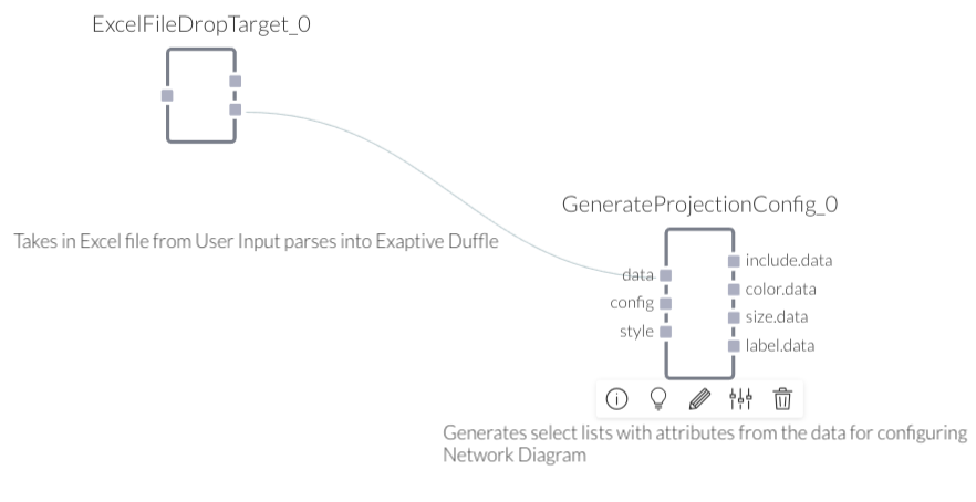
The data output from the Drop Target component should be wired to the Data input of the Projection Configuration component.
After dropping each component into the dataflow, the data coming out of the Excel File Drop Target needs to be sent to the Port Configuration component. To make this happen, wire the drop target's 'data' output to the port configuration's 'data' input. The same data also needs to be passed to the Basic Network Diagram component to be visualized, so send the file drop's 'data' output to the network diagram's 'data' input, as well.
Next, you'll want to connect the Port Configuration component so that it can guide the Basic Network Diagram to display the data just how you want. When the user selects attributes from a dropdown, the component will send those attributes on to the Basic network diagram. To make this happen, expand the 'data' input on the network diagram component, which will expose a number of sub-ports.
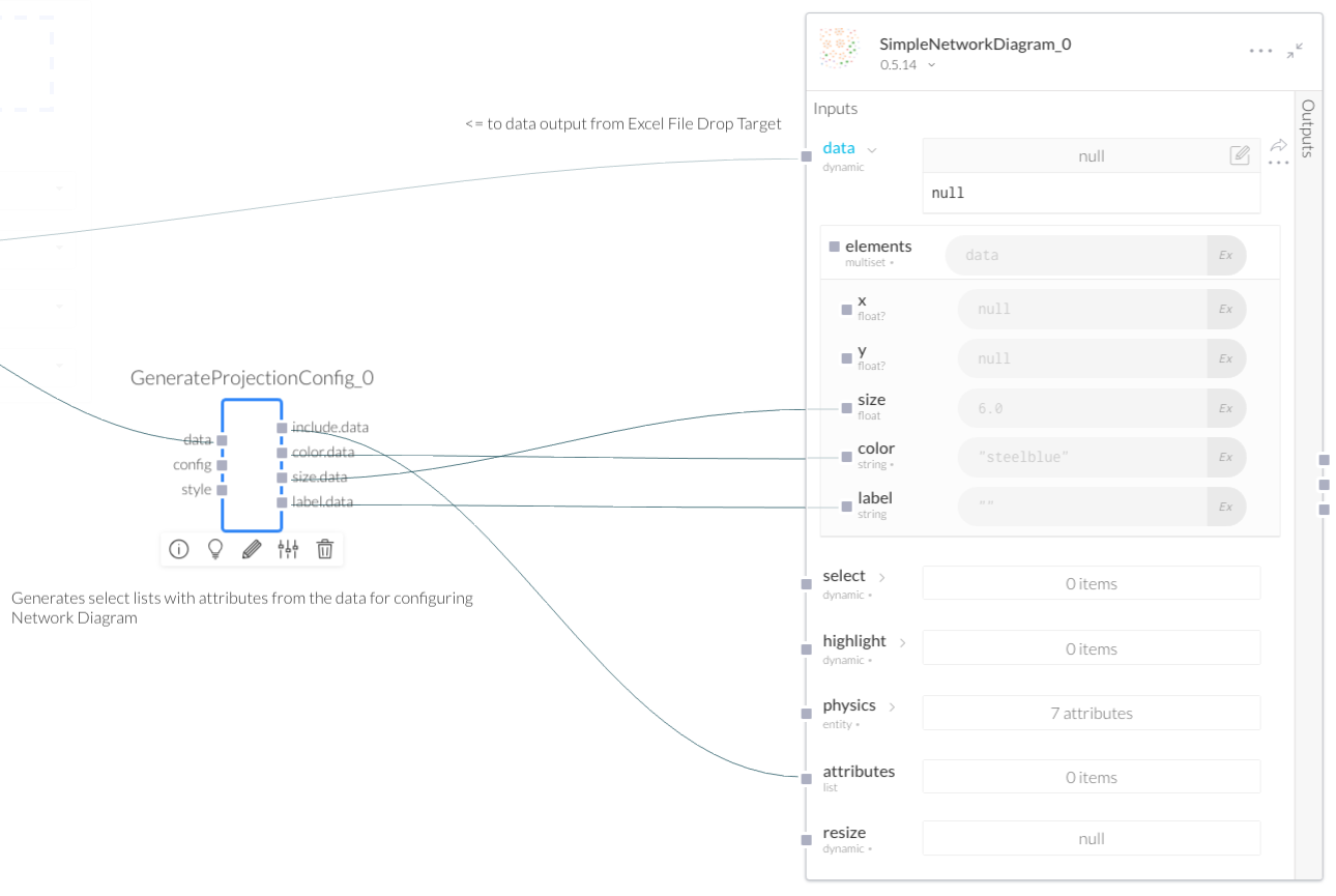
The Network Diagram component will need to receive data the Projection Configuration and File Drop components.
With the 'data' sub-ports exposed, wire the 'color.data', 'size.data', and 'label.data' outputs on the Projection configuration components to the 'color', 'size', and 'label' inputs on the network diagram component, respectively.
Last, the Network Diagram component will connect nodes according to the 'attributes' input. To do this, wire the 'include.data' output on the Projection Configuration component to the 'attributes' input on the Network Diagram component.
Run the xap.
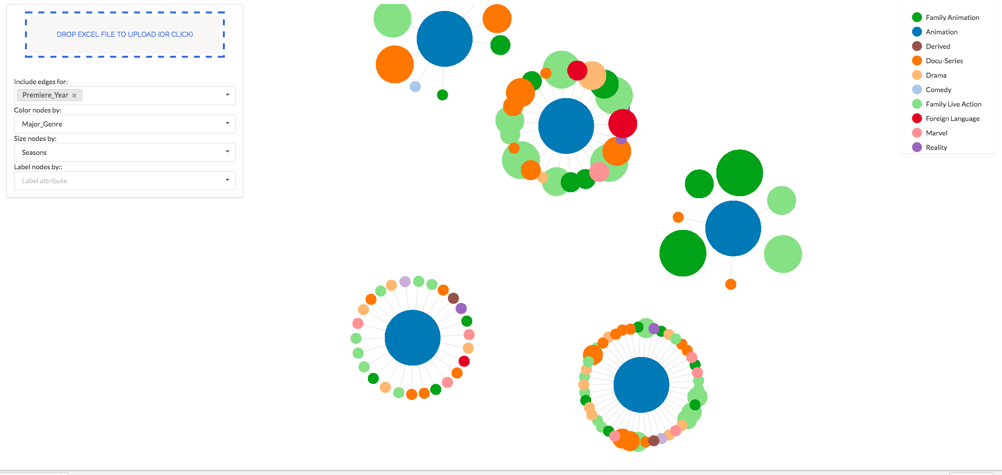
The dataflow programming portion of the xap is complete. In the xap preview, the file drop target will appear as a rectangle with a dashed border. The user can drop the file from their computer into the target to have it processed, or they can click on the target to launch a file explorer to find and select the file from their computer. Drop in your favorite XLSX file, play with the settings in the dropdown, and examine the resulting network diagram. Here's an interesting sample you can use with data on Netflix original content.
This visualization doesn't have to be the end of simplifying your data-to-insight workflow. Remember, everything exists in component form in the Studio, meaning you can incorporate these elements in an even more powerful data application. The platform is technology agnostic, meaning you can use Javascript, Python, or R in your dataflow.
Comments