
Nexflix has collected an impressive amount of data on Hollywood entertainment, made possible by tracking the viewing habits of its more-than 90 million members. In 2013, Netflix took an educated guess based on that data to stream its own original series, risking its reputation and finances in the process. When people were subscribing to Netflix to watch a trove of television series and movies created by well-established networks and studios, why create original content? Now, few would question the move.
Its first original series, House of Cards, garnered critical acclaim, earning 6 Emmys and 46 Emmy nominations since launching on February 1, 2013. From that day to February 1, 2017, Netflix's stock price increased 481%, beating the S&P 500 by 429% over the same period. And from the end of 2012 to the end of 2016, the streaming service increased its global subscriber base from 33.2 million to 93.7 million members.
We know some of this success comes from leveraging user data to drive IP purchasing decisions. But if we had just a fraction of this data and created a simple data application in the Exaptive platform, could we gain some insight into Netflix's overall OS strategy? What could we learn from visualizing this data, specifically, in a network diagram?
Netflix no longer offers a public API, so I scrounged up data on 109 Netflix original series from wherever possible, including Wikipedia and the Internet Movie Data Base (which is owned by Amazon). Where appropriate, genres were consolidated. Ratings reflected the most recent score available, did not reflect a specific season, and did not differentiate between ratings earned before and after being picked-up by Netflix (e.g., Arrested Development's score is a combination of ratings earned from its TV run and from its Netflix-exclusive fourth season).
We could simply load the data into a large table, and hope that we could divine some greater knowledge if we scan it long enough. We have a basic network diagram component in the Exaptive Studio to help us pick out patterns and relationships in data visually.
With some minimal dataflow programming, it was possible to load the resulting spreadsheet and generate some visuals.
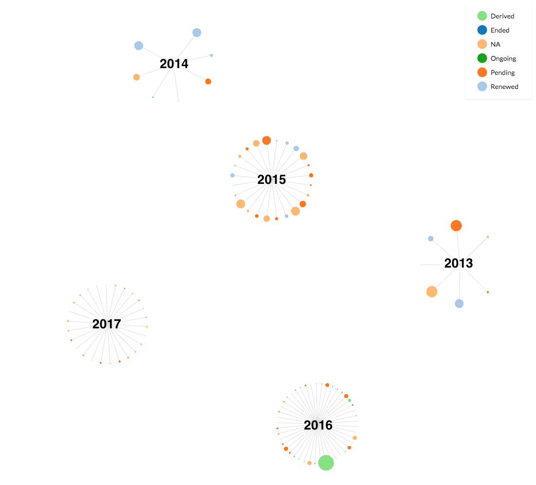
The nodes are linked by premiere year. (So the series cluster with others that launched in the same year.) The 2014 cluster has more original series in it than the 2013 cluster, the 2015 cluster has more original series in it than the 2014 cluster, and so on. It's clear that Netflix is producing more original series year after year.
If the nodes are then sized by the number of episodes produced, and also colored according to the status of the series (whether it is pending production, has been renewed, is ongoing, or has ended), a unique trend is found in the cluster of series launched in 2013. Check out the figure below.
The 2013 cluster has comparatively few original series compared to other years, but its nodes are larger, and a larger share of the series have been renewed. This is a sign that while 2013 was a modest year in terms of sheer number of original series, many of those series were critical successes and went on to have many episodes.
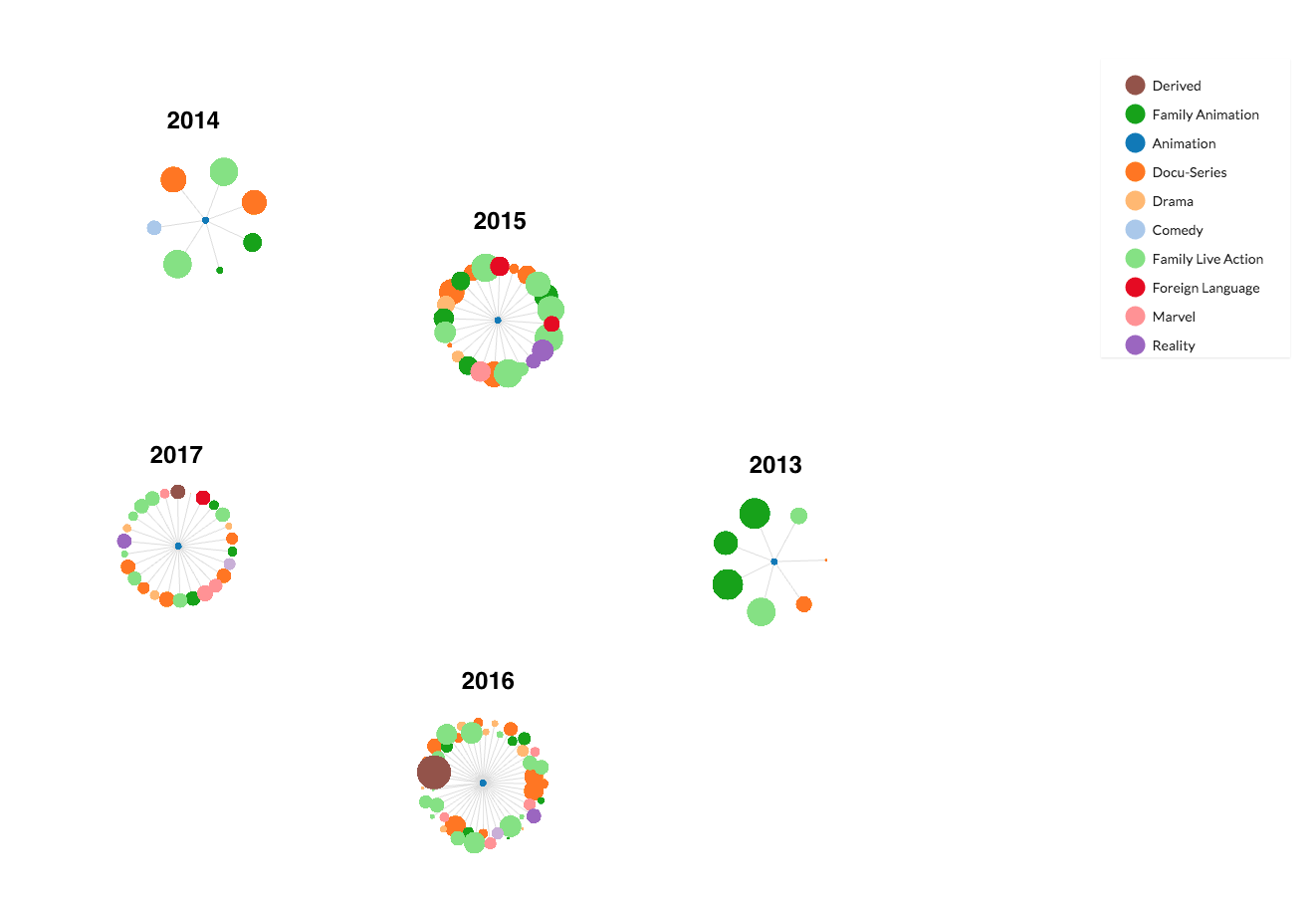
What happens if we color the nodes by genre (keeping them linked by premiere year)? The clusters with a large number of family animation series become apparent. Beginning with the 2015 premiere year, Netflix obviously has increased its family animation over time.
While most of the press surrounding Netflix's original offerings focuses on big hits such as "Orange is the New Black" and "Stranger Things," Netflix produces more series of family-oriented animation than series in any other genre.
The most voluminous genre of original Netflix content has flown under-the-radar, and they are not particularly popular with people who rate shows on IMDB. Some aren't rated at all. They may not even pop up on your watch list, due to Netflix's content-matching algorithm. And yet, Netflix seems to know they are popular among families seeking entertainment for young ones.
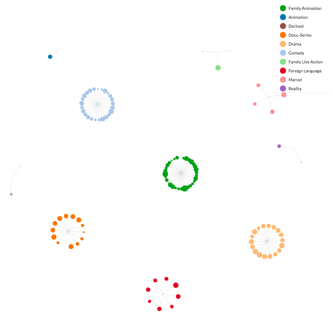
Now let's change the links (a.k.a. edges) and link the series by genre instead of their premiere year, coloring the nodes by their respective genres and sizing the nodes according to their IMBD rating. This allows for a comparison of critical success between the genres. Series will cluster around other series within the same genre. The larger the node, the more successful the series, and clusters with more of those large nodes indicate more successful genres.
Taking it one step further, if the series are linked by their status as well as their genre, they will still cluster near the same genre, but they'll also be pulled towards other series with the same status (regardless of genre). So if it turns out that shows in both the Marvel genre and family animation genre frequently are renewed, you would expect the Marvel cluster to appear near the family animation cluster in the diagram.

What happens in this case is that many family animation series end up clustering near docu-series and comedy series, which also have higher instances of renewed and pending shows.
That may come as a surprise to many subscribers, especially if Netflix hasn't been recommending family animation to them. Yet it absolutely follows Netflix's intention of increasing its original content into the future.
In 2016, the company said it had a goal of 50% original content, and that it was perhaps one-third to halfway to that goal. Netflix didn't, however, announce how those hours of programming would be divvied up across genres.
Comments