
 At the beginning of the year we posited that those of us who work with complex data need to move away from rows and columns and move towards graphs when thinking and working with our data. The first step is creating your model. This step is critical, and unfortunately, in my opinion, it is the least fun, mostly because this step is hard. We'd like to immediately be able to create cool network diagrams and query the data to find unique and innovative match-ups, but starting with the model is often the most non-intuitive, and over-looked step. So, while I want to jump into creating mind-blowing data visualizations, we are going to spend a bit more time with models and data entry. We want to ensure that you get the value in being able to generalize the problem you are mapping out.
Building (and revising) your model
In our model building challenge, many people were able to easily grasp creating an Element Type - it is simply a way to categorize things. It is in sorting out how these categories of things are connected to each other where things start to get complicated. In fact, we had many models in our model building challenge that stalled after creating one or more Element types.
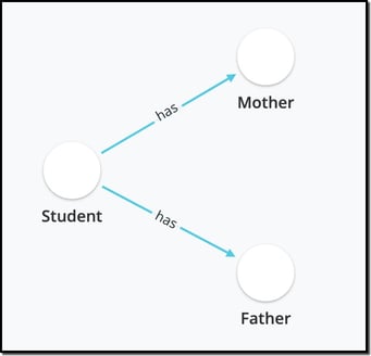
To illustrate what I mean by this, let's take the example from our knowledge graph blog-post in which a teacher maps out the student-parent landscape. In your first review of building this model, you might think that the model would include Students, Mothers and Fathers. However, if you have been a teacher for many years, your model will evolve as your students themselves become parents. In this case you can see that each one of these categories (Student, Mother, Father) - aka Element Types - could actually be described by a single category - Person. This illuminates one of the critical tenets in building a model: almost all of the complexity is in the connections, not in the Element Types themselves.
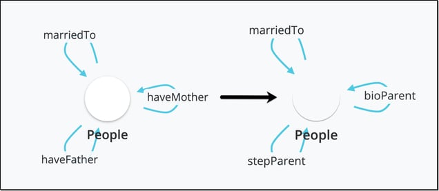
The evolved version of this model might simply include one Element Type: Person and then have distinct connections that describe the relationship between people (see image, left). One benefit of a graph database generally (and the Cognitive City specifically) is that you can add more information on the Element Type itself (i.e. gender) which allows you to add nuance to the model by capturing parent status (step- or bio-) in the connections.
What's next? Adding Data
The topic of adding data deserves a whole separate blogpost (at least) so all I will say is that adding data allows you to test the rigor of your model. In the Cognitive City, creating the Element Type itself starts to populate a form by which you can manually add data. Adding properties to your Element Type (i.e. gender on People) and the relevant connections will also create fields on this form that can be customized to be understandable to other human beings. An example of a form from this model can be seen below.
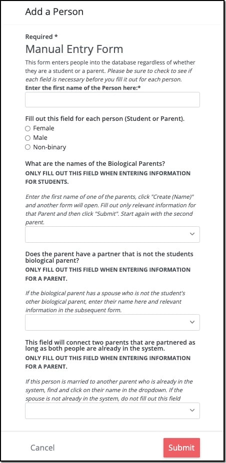
The form itself helps to illustrate that the complexity is in the connections themselves. Once you have confirmed the veracity of your model by having entered information manually, it's best to upload the rest of the data in bulk.
Visualizing your Data
The best way to see if your model accurately maps to your situation is to view the data you have uploaded into the graph. This is where we start generating pretty pictures. Using the model that captures whether a parent is a biological parent or a step parent from the image earlier, a class of 35 students would look something like this:
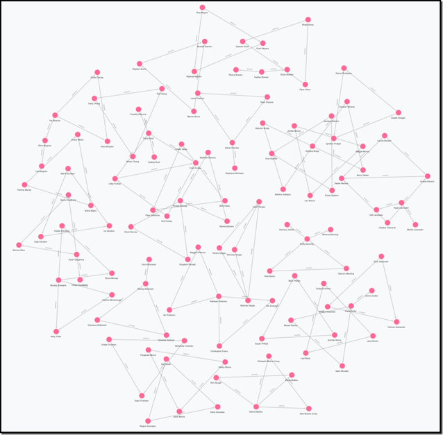
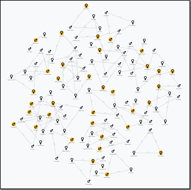
Each person in this view is represented by a pink circle, and the various relationships are distinguished only by the text on the connections between each person. This view while a little complex, still tells us little about the nuance in the relationships at a glance. To make the relationships easier to visualize, what is required is styling the view such that you can distinguish the people and their relationships. The following view shows the gender of each person (by matching icons to the property, gender) as well as which people are students (gold nodes).
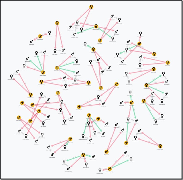
This view still doesn't illuminate students with a more complex relationship than a single biological mother and father. We can style the connections to to indicate parents that are biological (red lines) distinct from those that are step parents (green lines) and show which parents are married to each other (by shortening the length of the connections between married couples).
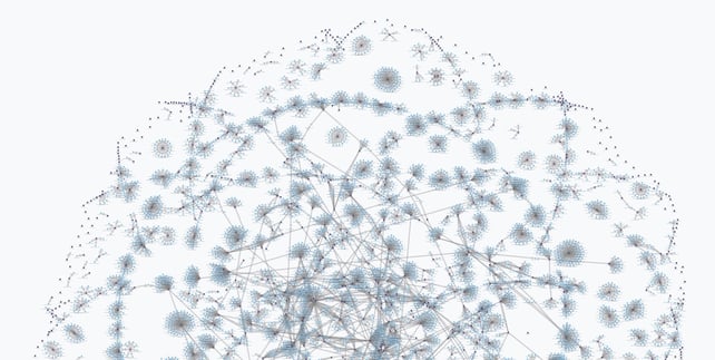
Sometimes understanding your data is best accomplished by representing it as a network diagram, but not always. This image, while beautiful in its own way is the perfect hairball. The data modeled here contains only people and the projects they are managing.
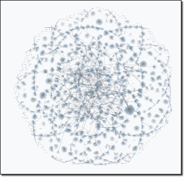 The power in using a knowledge graph is in being able to navigate hairballs like these and pull out the information you are most interested in. In fact, you engage with knowledge graphs every day without ever seeing nodes and edges. Your timeline or your feed is a linear (or not, to the chagrin of social media users), representation of the data in a knowledge graph. The cards presented to you while shopping online are another example of nodes in a knowledge graph.
To see the many ways that data can be represented visually, check out the Living Systematic Review of Covid Data that can be found at iddo.cognitive.city.
Comments