
We recently had to prototype a data application over a supercomputer tuned for graph analysis. We built a proof-of-concept leveraging multiple APIs, Cray’s Urika-GX and Graph Engine (CGE), and a handful of programming languages in less than a week.
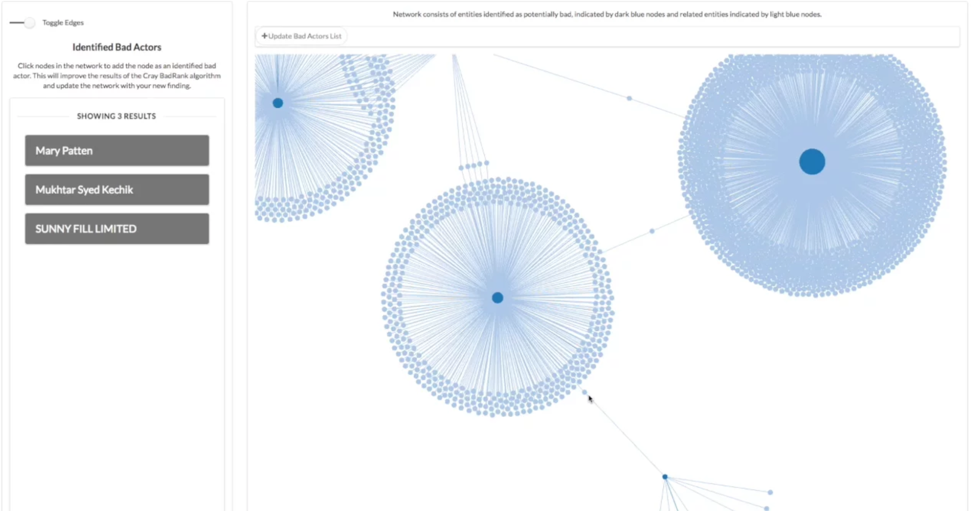
The application consumes and visualizes the Panama Papers, over 11.5 million documents detailing international financial and legal misconduct and covering relationships between over 500,000 companies, foundations, and trusts. Users build a list of suspected bad actors by interacting with a high-performance network diagram.
Design Considerations: APIs, Visualizations, and Cheat Codes
This was just a proof of concept, but it had to prove some worthwhile capabilities and address a few interesting challenges.
First, our industry partners wanted to allow multiple users to build and manage a list of bad actors together. We decided to use data.world to host this list. The xap (what we call a data application made with the Exaptive Studio) would be able to query the Panama Papers on Cray’s supercomputer and the bad actor’s list data.world API, and it would write back to the data.world as users identified more potential bad actors. (If you’re not familiar with data.world, here’s a nice intro.)
Our next worry was the performance of the visualization. A network diagram seemed the inevitable place to start to visualize the myriad of people and corporate entities implicated in the data. But big network diagrams are notoriously bad performers in the browser. Networks with more than 1,000 nodes and edges tend to be useless hairballs, and the point here was to create a useful visualization of 50,000 nodes and edges. So we opted to use a WebGL network diagram rather than the more popular d3 variety. (There is a public WebGL network diagram component for the Studio and a quick-start version with some built-in configuration.)
Lastly, the Cray CGE uses RDF and the native format of the Panama Papers database is neo4j. We, thankfully, found a website that had already done the conversion to RDF. We just had to create some SPARQL components to work on the data.
What we Made and How it Works
We use a visual, dataflow programming environment to build applications. Data flow between code modules – “components” – that perform operations on the data. Here’s how this xap looks under the hood:
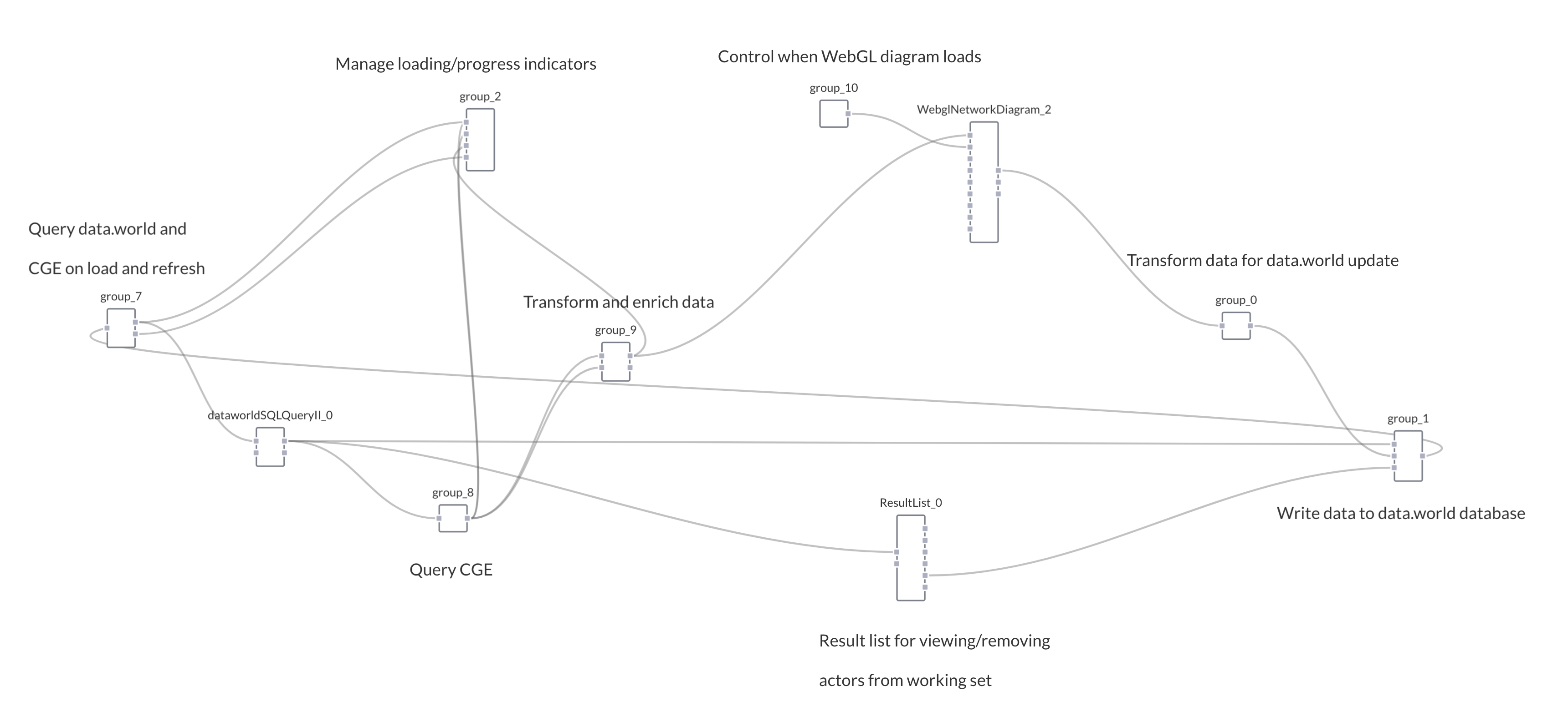
First, we kick-start the xap with a few known bad actors. With a little internet research we found people implicated in the Panama Papers that have been convicted of securities fraud, and we prepopulated the list of bad actors in data.world with these entities. The xap queries data.world and loads the list upon the application loading in the browser (far left of the diagram, group 7). When the xap loads it pulls in a list of these confirmed bad actors.
A python server then sends a query to the Cray CGE (group 8), consisting of the list from data.world. Cray’s CGE applies a special BadRank query, developed by Cray, to label certain entities found in the Panama Papers as “bad” based on their relation to known bad actors. It returns a new set of entities, in JSON, based on their relations to the already identified bad actors.
These newly identified bad actors are then added to the list in data.world (group 9). So we need not change the Panama Papers database to accommodate this new data. We’re accessing a number of data sets and synthesizing them in the application for visualization.
The xap then performs a second query, based on the identified potentially bad actors, to bring back data and build a network of the entities involved in the Panama Papers – the bad actor(s), the companies in which they own stock, countries of affiliation, etc. This acts as an enrichment query so the xap produces a rich network visualization that human eyes can explore for more clues (WebglNetworkDiagram_2)
User interaction with the front-end of the xap - the network diagram – updates the bad actors list in data.world (group 0 and group 1).
Then, the next time the xap loads the list loads to prime the xap with the putative bad actors already identified, creating a productive feedback loop between users and the BadRank query.
We also added a results list component (ResultList_0) to show each suspected bad actor. Users can remove suspects from the working set in data.world by clicking results in the list. It takes in data from the data.world query (dataworldSQLQueryII_0) and outputs data to write to the list on data.world.
#ExaptiveFTW
So, how did we do? The demo went well, and the customer was impressed. It was a nice win.
And wins are important to celebrate in the daily race of building a company. So permit me a victory lap? In one week, we demonstrated the ability to:
-
Connect to remote compute services, the Cray Graph Engine, via web APIs and SSH;
-
View 10,000 nodes and edges in network diagram embedded within a webpage;
-
Read and write data interactively through an API (data.world);
-
Generate SPARQL queries;
-
Leverage python, SPARQL, SQL, javascript and webGL, without writing glue code (what we mean when we say the Studio is technology agnostic);
-
Use user-interactions with the network diagram to generate dynamic queries; and
Develop a POC showing all capabilities working simultaneously in much less than on FTE's week worth of time.
Comments