
Parallel coordinates is one way to visually compare many variables at once and to see the correlations between them. Each variable is given a vertical axis, and the axes are placed parallel to each other. A line representing a particular sample is drawn between the axes, indicating how the sample compares across the variables.
Previously, I wrote how it's possible to create a basic network diagram application from just three components in the Exaptive Studio. Many users will require more scalable from a data application, and fortunately the Studio allows for the creation of something like our Parallel Coordinates Explorer. Often times, a parallel coordinates diagram can also become cluttered, but fortunately, our Parallel Coordinates component lets users rearrange axes and highlight samples in the data to filter the view.
It helps to use some real data to illustrate. One dataset that many R aficionados may be familiar with is the mtcars dataset. It's a list of 32 different cars, or samples, with 11 variables for each car. The list is derived from a 1974 issue of Motor Trend magazine, which compared a number of stats across cars of the era, including the number of cylinders in the engine, displacement (the size of the engine, in cubic inches), economy (in miles per gallon of fuel), and power output.
Let's say we're interested in fuel economy, and want to find out characteristics could signify a car with good fuel economy. Anecdotally, you may have heard that larger engines generate more power, but that smaller engines generate better fuel economy. You may also have heard that four-cylinder engines are typically smaller in size than larger engines. Does this hold true for Motor Trend's mtcars data?
To find out we'll use a xap (what we call a data application made with Exaptive) that lets a user upload either a csv or Excel file and generates a parallel coordinates visualization from the data. But a data application is more than a data visualization. We're going to make a data application that selects and filters the data for rich exploration.
In our dataflow programming environment, we use a few components to ingest the data and send a duffle of data to the visualization. Then a hand-full of helper components come together make the an application with which an end-user can explore the data.
Here's the dataflow diagram, with annotations.
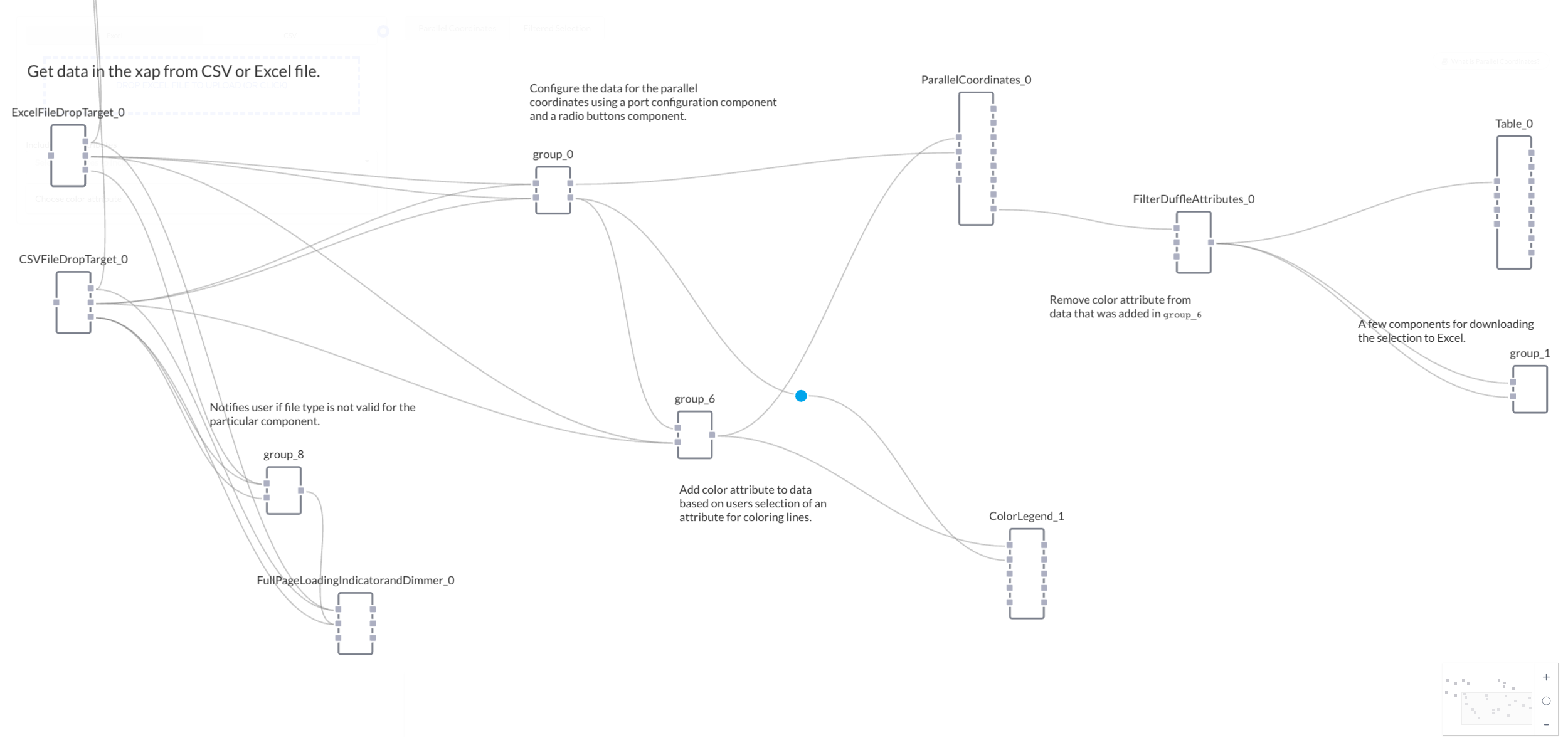
The journey begins with two file drop target components -- one for CSV files and one for Excel files. An additional group of components (group_5), consisting of a button group and a visibility toggle, enable the user to select between the file drops. Each time the button group is clicked, the visibility toggle will hide one file drop and reveal the other.
The mtcars dataset starts life as a csv:
Mazda RX4,21,6,160,110,3.9,2.62,16.46,0,1,4,4
Mazda RX4 Wag,21,6,160,110,3.9,2.875,17.02,0,1,4,4
...
which, when placed into the CSV file drop, is turned into the following duffle:
{
"name": "Mazda RX4",
"mpg": 21.0,
"cyl": 6,
"disp": 160.0,
"hp": 110,
"drat": 3.9,
"wt": 2.62,
"qsec": 16.46,
"vs": 0,
"am": 1,
"gear": 4,
"carb": 4
},
{
"name": "Mazda RX4 Wag",
"mpg": 21.0,
"cyl": 6,
"disp": 160.0,
"hp": 110,
"drat": 3.9,
"wt": 2.875,
"qsec": 17.02,
"vs": 0,
"am": 1,
"gear": 4,
"carb": 4
},
...
]
Once a file drop receives an appropriate file, it will trigger a Full Page Loading Indicator component, giving the user a visual indication that data is being processed. (The loading indicator is particularly useful in xaps that require an extensive amount of compute time, alerting users to the fact that the xap is working, and has not hung up or experienced an error.)
Again, if you're working with a large number of samples and variables, the parallel coordinates visualization may be hard to read. To help with this problem, a group of components lets the user to filter the data to only show a certain number of variables (the axes) at a time. Once the file drop components parse the files, they will send the data as a duffle to group_0, which generates UI elements and handles the filtering process.
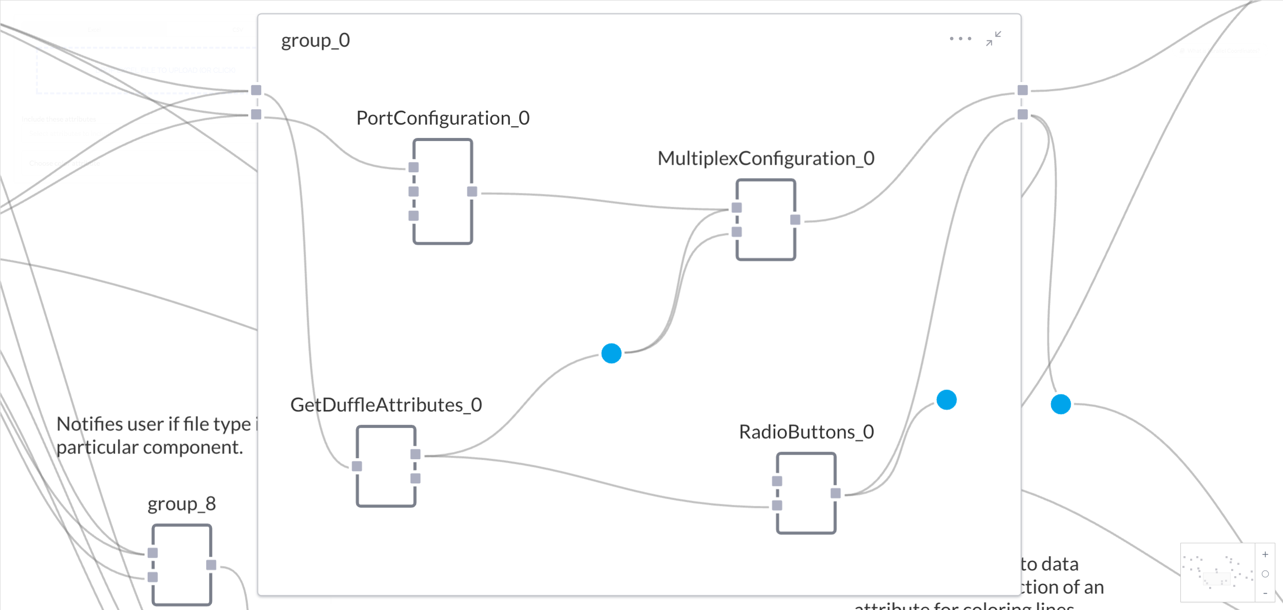
Group_0 consists of four components, the one of which is a Port Configuration component. This component reads the duffle from the file drop, and provides the user with a dropdown to select which axes to show in the vis. When a user makes a selection, that information is passed to a Multiplex Configuration component, which generates a string to configure the Parallel Coordinates component with those selected axes.
So the mtcars data duffle is sent to the Port Configuration component, which generates a dropdown with selections for each variable. Selecting "name", "mpg", "cyl", and "disp" from the dropdown, the Port Configuration component outputs the list:
"name",
"mpg",
"cyl",
"disp"
]
which gets sent to the Multiplex Configuration component, which sends the following duffle to the axes port of the Parallel Coordinates component:
Because this duffle is working as a selector for the Parallel Coordinates component, it is known as a "duffle selector."
The Multiplex Configuration component in group_0 also needs a list of the original attributes as strings sent to its defaultAttributes port. So a third component, the get duffle attributes component, finds all the unique attributes in the data, and sends that data as a duffle of attributes to a merge gate. The merge gate then turns the duffle of attributes into a list of attributes, which gets passed on to the Multiplex Configuration component.
Thus, the Get Duffle Attributes component converts the original mtcars data duffle into the following duffle of attributes:
{
"attribute": ""
},
{
"attribute": "mpg"
},
{
"attribute": "cyl"
},
...
]
Which the data merge gate turns into the following list for the Multiplex Configuration component:
"",
"mpg",
"cyl",
...
]
Finally, a fourth component in group_0 called Radio Buttons generates a list of radio buttons from the same duffle of attributes from the Get Duffle Attributes component. The user can again pick from attributes, but this time the action will set off a series of events that colors a sample's line according to one of the attributes.
For the exploring fuel economy in mtcars data, a logical choice for the color attribute would be "cyl", which is the number of cylinders in the car's engine. There's only three variations of cylinders in this dataset; a car has an engine with either 4, 6, or 8 cylinders. Since there are only three variations, there will only be three different colors of lines, making it easier to spot trends based on groupings of cars with the same number of cylinders.
Selecting "cyl" from the Choose color attribute radio buttons triggers the Radio Buttons to output the string:
Group_0 lets the user select which axes to show and set how lines are colored in the visualization, but group_6 is the group of components that actually applies those color attributes to the data. The group consists of a data merge gate wired to a D3 Color Map component, which in turned is wired to a data gate.
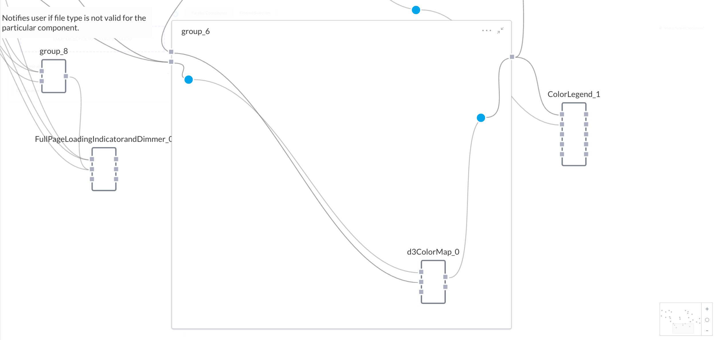
The D3 Color Map receives the "cyl" string from the Radio Buttons component from group_0, but is also receives the original mtcars duffle, albeit routed through the data merge gate. The data merge gate takes the mtcars duffle, and outputs the following:
"nodes": [
{
"name": "Mazda RX4",
"mpg": 21.0,
"cyl": 6,
"disp": 160.0,
"hp": 110,
"drat": 3.9,
"wt": 2.62,
"qsec": 16.46,
"vs": 0,
"am": 1,
"gear": 4,
"carb": 4
},
{
"name": "Mazda RX4 Wag",
"mpg": 21.0,
"cyl": 6,
"disp": 160.0,
"hp": 110,
"drat": 3.9,
"wt": 2.875,
"qsec": 17.02,
"vs": 0,
"am": 1,
"gear": 4,
"carb": 4
},
...
]
}
So when the Color Map component receives the converted mtcars duffle, along with the "cyl" string from group_0, it adds a color attribute to the entities based on the "cyl" attribute, and outputs the following:
"nodes": [
{
"name": "Mazda RX4",
"mpg": 21.0,
"cyl": 6,
"disp": 160.0,
"hp": 110,
"drat": 3.9,
"wt": 2.62,
"qsec": 16.46,
"vs": 0,
"am": 1,
"gear": 4,
"carb": 4,
"color": "#1f77b4"
},
{
"name": "Mazda RX4 Wag",
"mpg": 21.0,
"cyl": 6,
"disp": 160.0,
"hp": 110,
"drat": 3.9,
"wt": 2.875,
"qsec": 17.02,
"vs": 0,
"am": 1,
"gear": 4,
"carb": 4,
"color": "#1f77b4"
},
...
]
}
This duffle is passed to a Color Legend component, and also is sent to the data input of the Parallel Coordinates component. This is the data that Parallel Coordinates draws from to create a visualization.
From the original file drop, to components in group_0 and group_6, and finally on to the data and axes inputs on the Parallel Coordinates component, mtcars' data journey is complete. Well, almost complete.
Clicking and dragging the mouse over an axes will select a sample, causing Parallel Coordinates to output just the data from those samples. That output is filtered, then received by a table component, which produces a table of those samples on the page. An additional group of components, called group-1, creates buttons and allows the user do download the selected samples as an Excel file. Handy, if you'd prefer to drill down on only a select number of entities.
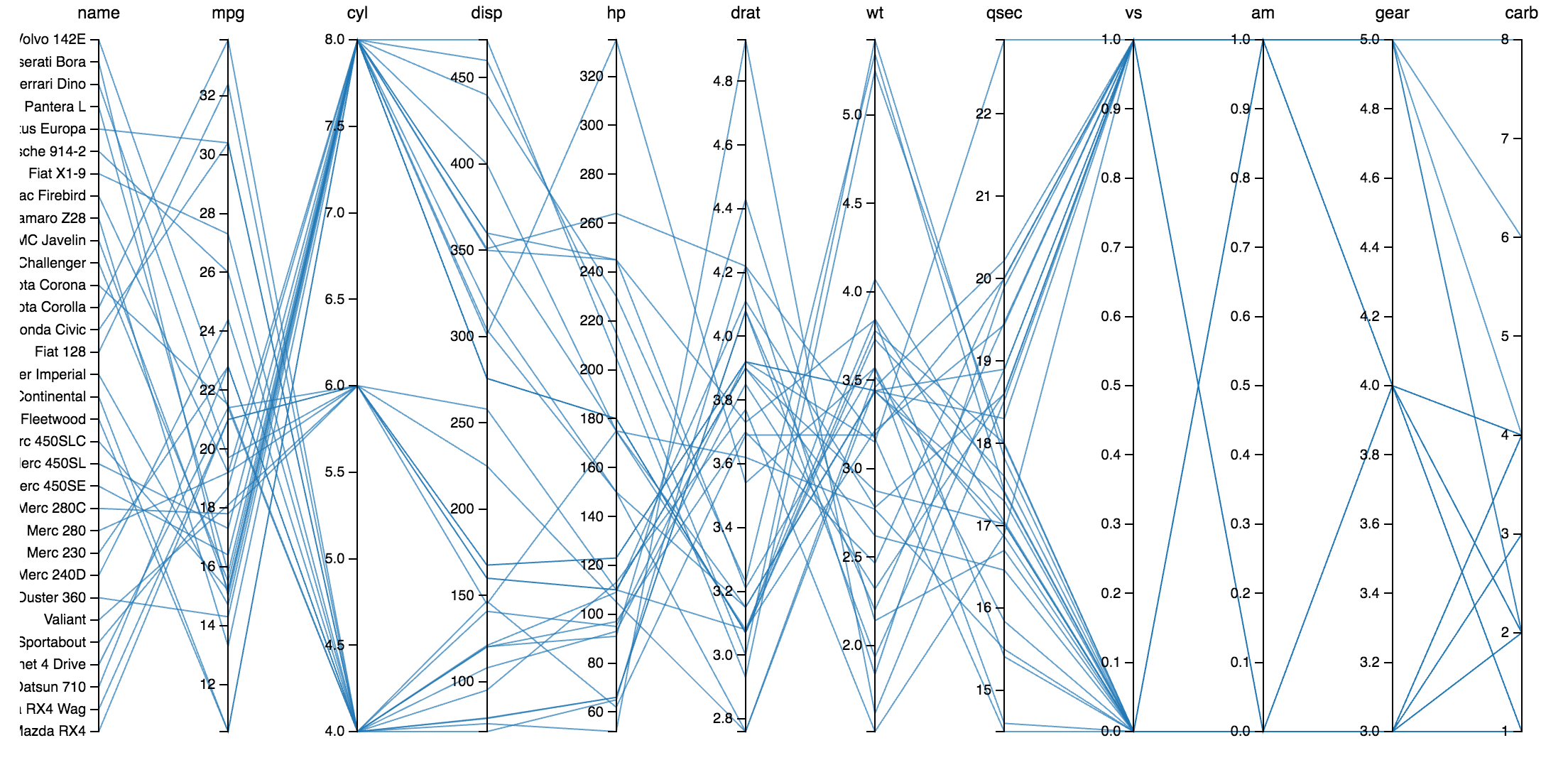
What does all this tell us about the mtcars data? Whittling the data down to name, miles per gallon, number of cylinders, and displacement, and then coloring lines according to number of cylinders, shows a distinct trend with regard to fuel economy and engine size.
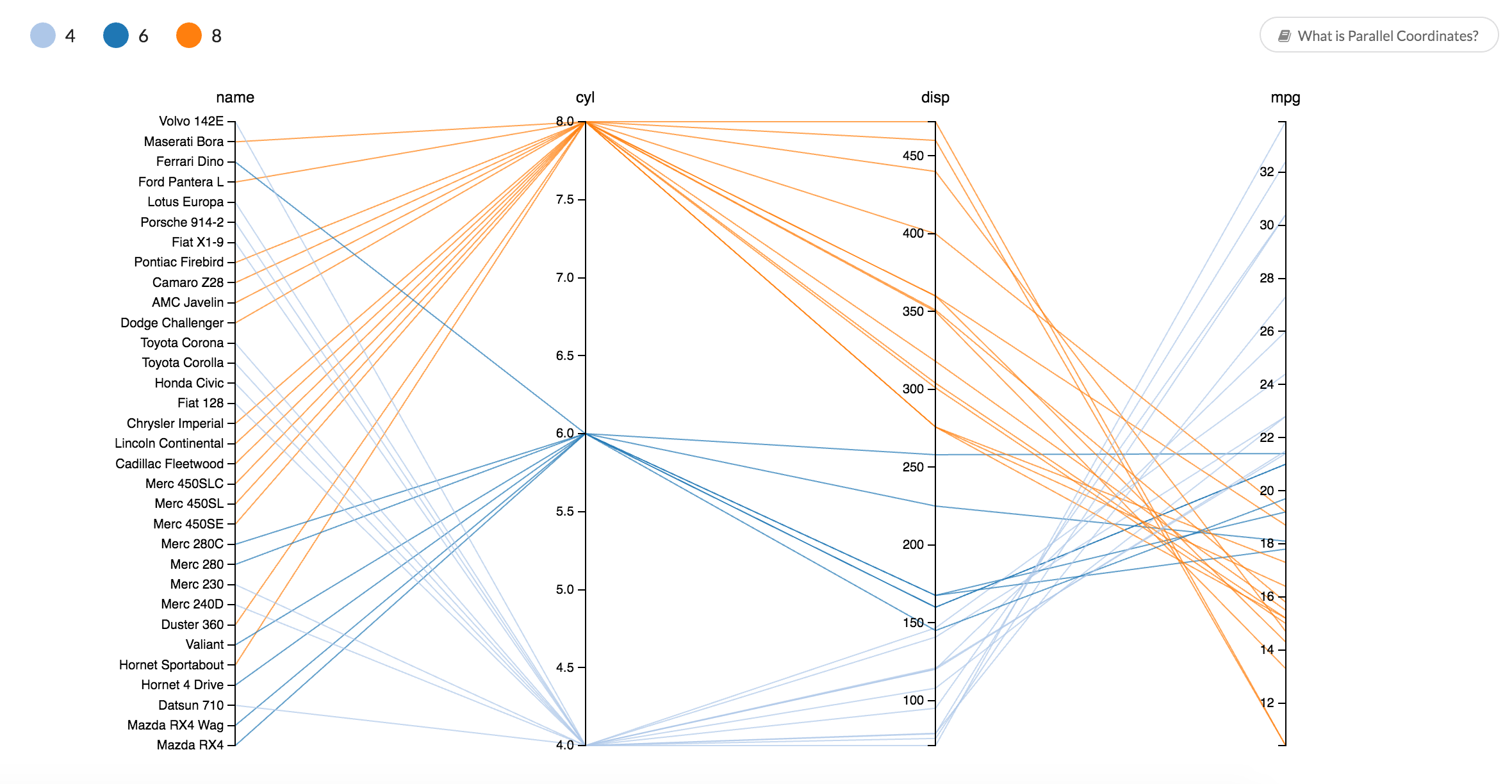
Cars with larger engines tend to have more cylinders. There aren't any four-cylinder engines, such as in the Toyota Corolla, larger than 150 cubic inches (also known as 2,468cc or 2.4 liters) in this data. Additionally, cars with those smaller engines tend to be more economical, ranging from around 21 to 33 mpg. Thus, smaller, four-cylinder cars tend to achieve better fuel economy. Eight-cylinder cars tend to be larger and more thirsty for fuel, while 6-cylinder cars compromise between fuel economy and engine size.
Feel free to explore the mtcars dataset yourself in the Parallel Coordinates Explorer, or see what you can discover from your own dataset. Additionally, if you have a Exaptive account, you can add the Parallel Coordinates Explorer to your own studio, or edit it for your own purposes.
Comments