
Can we predict what the next hub of tech entrepreneurship will be? Could we pinpoint where the next real estate boom will be and invest there? Thanks to advances in machine learning and easier access to public data through Open Data initiatives, we can now explore these types of questions.
I took an approach originally developed to group countries for a global health policy initiative and brought it closer to home. Using data from the US Census and FBI, I developed an interactive data application for grouping US cities based business and technology, crime, demographics, health and more.
The screenshot below shows one such result looking at tech hubs. The color is the cluster assignment, the size of the city is the percentage of college degrees, and the opacity is access to healthcare. I placed more emphasis on business, technology and education metrics to guide the analysis. The results show that the San Jose/Palo Alto area has more in common with its West Coast brethren, Denver and Austin, while the San Francisco metro area has more in common with big cities along the East Coast and in the Midwest. It also shows a strong cluster of Midwestern tech hubs including Columbus, Indianapolis, Oklahoma City, and Salt Lake City.

You can explore the data yourself. The application lets you adjust the relative weight of factors, e.g. demographics, health, and education, to see what city clusters manifest.
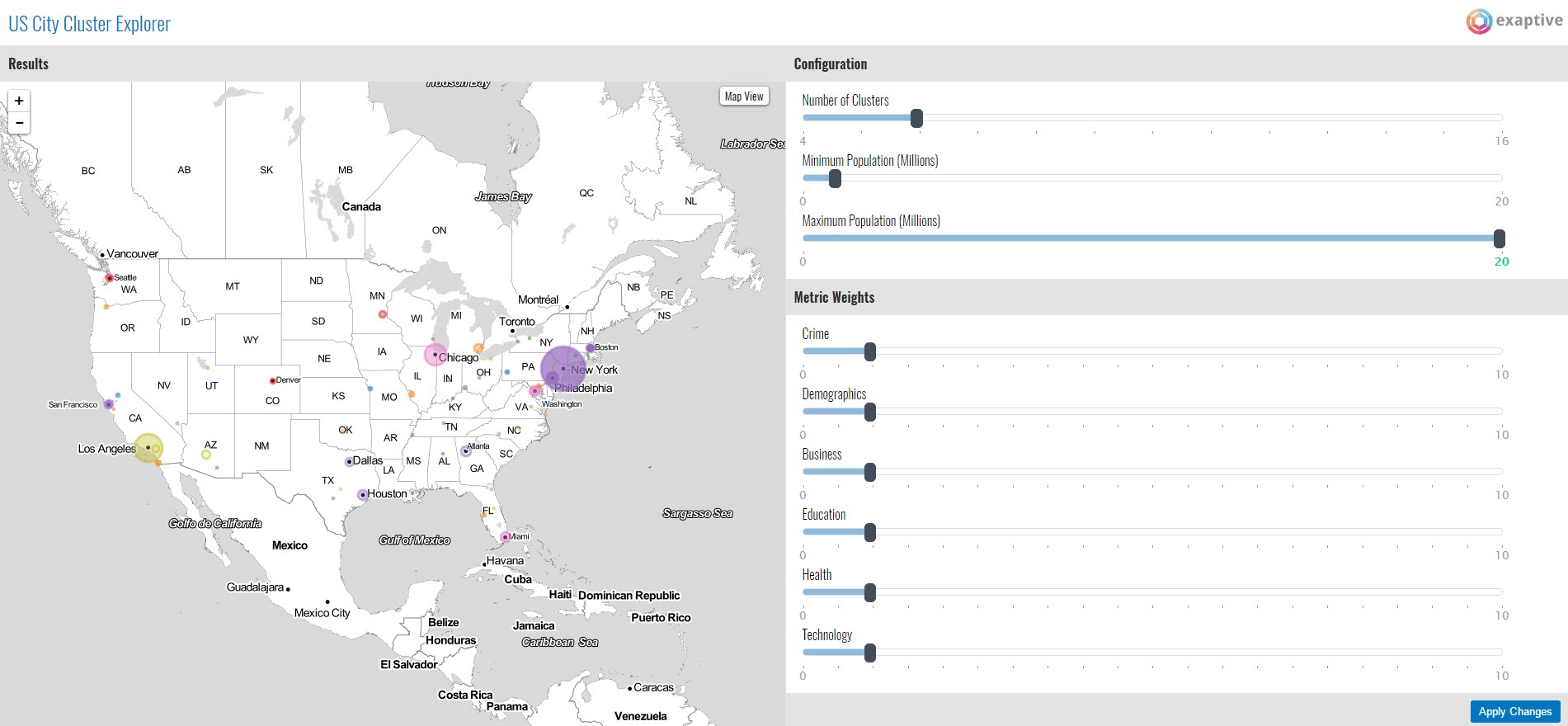
You can also toggle between a map and a network visualization to view the clusters.

If you find any interesting results, I’d love to hear about it. If you end up striking it rich after buying real estate in the next Silicon Valley, kickbacks are welcome.
Here’s how I got the data, wrangled it, and analyzed it to enable some visual exploration in a data application.
How the Wild West (of Data) Was Won
While Open Data initiatives have led to increased transparency, they have in no way made things easy. Data on government sites are in a variety of formats and states of completeness/quality and can be quite difficult to locate. After days of hunting around websites and exploring data, I settled in on a handful of files that had trend data for US metropolitan areas in some text-based format, like a CSV or Excel file.
The sources include:
-
US Census business patterns for establishment and payroll data by industry and city
-
US Census databooks for selected extracts from the 2010 census, including metrics on demographics, health, education, labor and immigration
-
FBI Uniform Crime Reporting (UCR) data for violent and non-violent crime
Downloading the data was just the start. From there, I needed to massage the data extensively, mapping codes to names, handling variations in city names, and transforming three different formats into a single standardized JSON object for use in later Python and REST components.
For those interested, the original and formatted data files are available in GitHub.
Feature Presentation
Dealing with raw time series data is tricky. Small fluctuations in the shape or height of the curve, or even just a shift of a few units of time, can throw comparison algorithms into a tailspin. In fact, my first data analysis job was as an organic chemist intern comparing resin weight distribution graphs that looked like time series. If only I had the tools then that we have at our collective disposal now!
People have devised many sophisticated techniques to handle these situations, and one of the most popular is the Fourier Wavelet Transform. Algorithms like these are used for everything from audio analysis (think Spotify or Pandora) to healthcare monitors and financial markets.
The goal of all these techniques is to convert a raw piece of data like a time series into features: a more abstract representation of its characteristics like height and shape. For this analysis, I chose the Symbolic Aggregation approXimation (SAX) algorithm from Keogh and Lin at UC Riverside. SAX shares many of the benefits of Fourier and other approaches but is more compact, representing features as strings. This is also useful because bioinformatics is ripe with machine learning algorithms for analyzing strings like DNA and proteins.
I used a Python module for SAX by Nathan Hoffman and adapted it to include the average value of a time series and accommodations for missing values.
One of These Things Is Not Like the Other
Once I converted the cities' time series data to a series of strings, I could now more easily compare two cities metric-by-metric. But I still needed a way to calculate similarity. For that, I leaned on my biochemistry background and used the Levenshtein distance, a formula that calculates the distance between two strings accounting for additions, substitutions and deletions. This approach is commonly used for comparing strings of DNA, RNA or protein sequences. It is forgiving to subtle shifts in the strings, which works well for both genetic mutations and, in our case, minor differences between time series trajectories.
His Fingerprints Were All Over It
Doing this similarity calculation for every metric and every time we compare two cities is both time consuming and yields poorer results. We humans excel at classifying things by creating higher-order features from more detailed raw data, and the same is true for computers.
Now that I had time series features and a way to compare them, I created fingerprints for each city. I assigned a class for each city and metric using a clustering algorithm, then I combined them into a single feature vector. The result was a compact, 60-digit numeric vector for each city that could be quickly compared with another city's feature vector.
Cluster's Last Stand
Now that we have feature vectors per city, I was able to cluster the cities using standard clustering algorithms. We explored both KMeans and KMedoids for their simplicity, but other more sophisticated clustering algorithms would work just fine.
This is an incredibly exciting time. We increasingly have access to rich, complex data sets and the data analysis and visualization tools to make sense of it. Imagine what else we can learn and apply to improve the lives of so many.
You can check out a webinar I conducted on the topic for a bit more detail about the algorithmic techniques. I created the Xap (what we call data applications created with the Exaptive Studio), with the help of Mark Wissler and Derek Grape on the Exaptive team.
Comments