
One of the perennial challenges in visualizing complex networks is dealing with hairballs: how do you draw a network that is so large and densely interconnected that any full rendering of it tends to turn into an inscrutable mess? There are various approaches to addressing this problem: BioFabric, Hive Plots, and many others. Most involve very different visual abstractions for the network.
There is something compelling, however, in seeing the full, messy complexity of a network laid out in one image. Many of the alternate approaches have the disadvantage of being less intuitive. Most people are accustomed to inferring network structure from a collection of dots and lines; not so much from a matrix representation. I wondered if there wasn't a way to retain the immediacy and intuitiveness of, say, a force-directed layout, while somehow ordering it and stretching it out in a way that would give the important elements room to breathe. In this blog post I will describe an effort to find this middle ground.
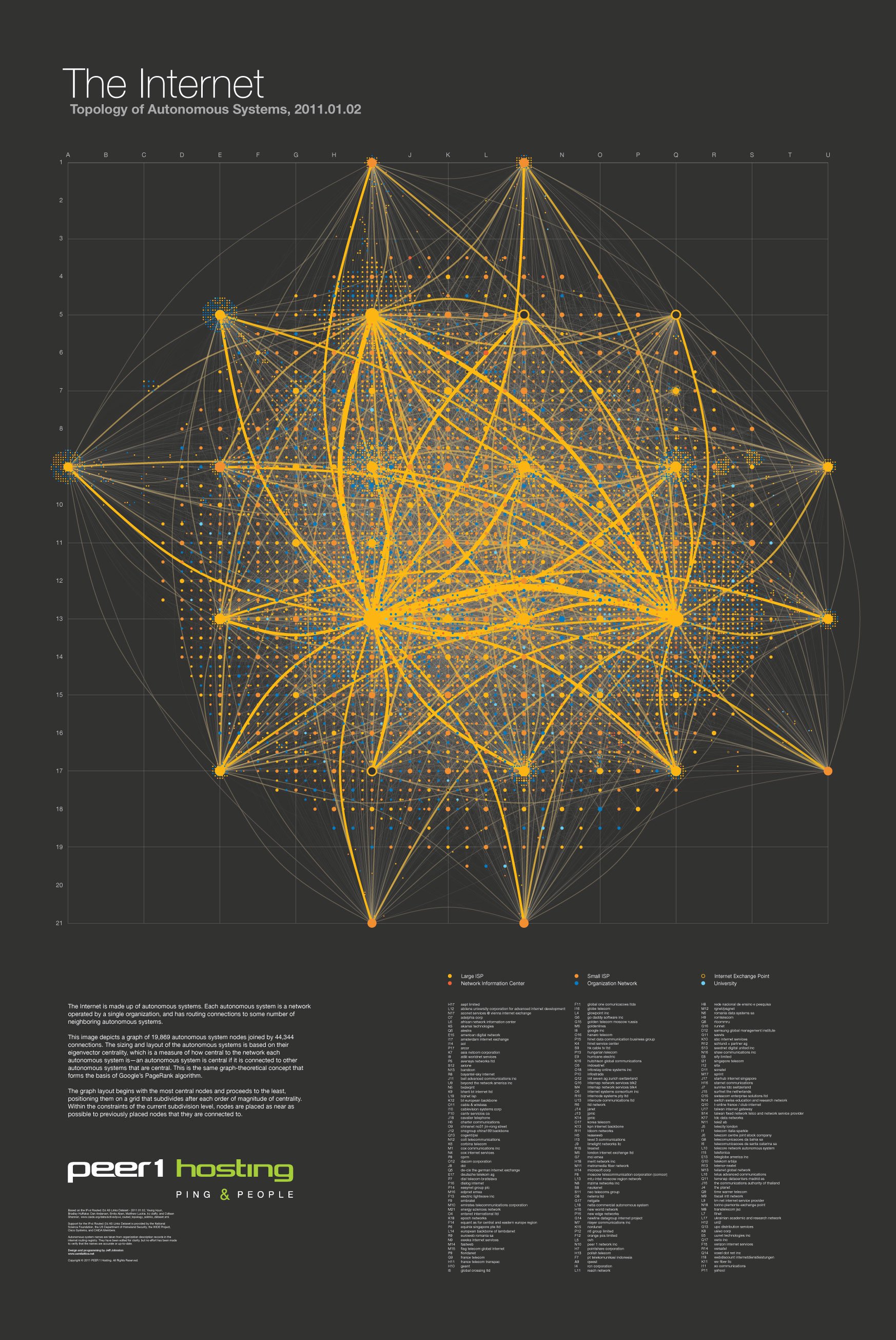
What are the most important elements? In order to emphasize the most relevant structure, I decided to focus on the most central nodes in the network. While networks inherently have no true center, some nodes are more central than others. Of the various ways of measuring centrality in a network, perhaps the most elegant is the notion of eigenvector centrality. In a nutshell, a node is considered central if it is connected to other nodes that are central. Somewhat magically—to a non-mathematician—it turns out there is usually a unique solution to this recursive definition. This concept also forms the basis of Google's PageRank algorithm.
Armed with this technique of ranking nodes from most central to least central, I set out to create a deterministic layout that would privilege the most central nodes—showing the connections between them clearly, giving them the space to remain distinct from one another, while allowing less central nodes to nestle in between them in clusters. This was accomplished with a subdividing grid.
Starting with the most central, nodes are placed on widely-spaced grid points. Each node is placed as close as it can be to the centroid of any previously placed nodes that it is connected to. As the nodes being placed become less central, the grid is subdivided, opening up new grid points in between the existing ones. As the intention was that this should happen on an order-of-magnitude basis, this is triggered by the logarithm of the centrality: each time the log centrality passes an integer value, the grid is subdivided.
In hallowed network visualization style, nodes are rendered as circles, and edges are curved lines between them. Node sizing is based on node centrality. Edge width is also based on the centrality of the nodes they connect.
In 2011 I used this technique to design a poster for web hosting company Peer 1—a map of the internet. The data set was the network of autonomous systems that constitute the internet, as observed by the researchers at CAIDA. The resulting image is indisputably a hairball, but it achieves the design goals of showing the connective structure of the most central nodes alongside the overall complexity.
This was a static image meant to be printed on a poster. With an interactive visualization further exploratory power can be gained by highlighting connections to or from nodes of interest. A project I created after attending the always-fantastic Eyeo Festival for the first time in 2012 illustrates this. On the eve of the conference, I pulled the (self-reported, but well-populated) list of conference attendees from Lanyrd, and then used the Twitter API to determine the follower relationships between attendees. After the conference ended, I extracted the data again. Comparing these data sets shows the new connections that were made at the festival, and mousing over a node draws focus to its connections exclusively. Try the interactive version!

There are many opportunities for improvement of this approach. Using a triangular grid instead of a square grid would make more efficient use of space, approximating a 2-D close-packing layout. The scaling factor of the node circles should be rethought, as the current approach can lead to overlapping circles if you zoom in on the clustered, least central nodes of large networks. Another problem is that even though the layout is completely deterministic for a given network, it is not stable with respect to changes in the network; small changes can ultimately lead to large shifts in the layout. For example, if one relatively central node ekes past another node in centrality, perhaps due to a single seemingly unimportant node appearing at the edge of the network, the entire layout can shift. Perhaps going back to an energy-based optimization method—but on the quantized and subdivided grid—would produce more stable results.
Since I became a part of Exaptive several years ago, it has been one of our enduring goals to implement this subdividing centrality layout in the modular Exaptive dataflow system. We recently had occasion to do so! Watch this space for a future post detailing our experiences with subdividing centrality layout as an Exaptive component.
Comments